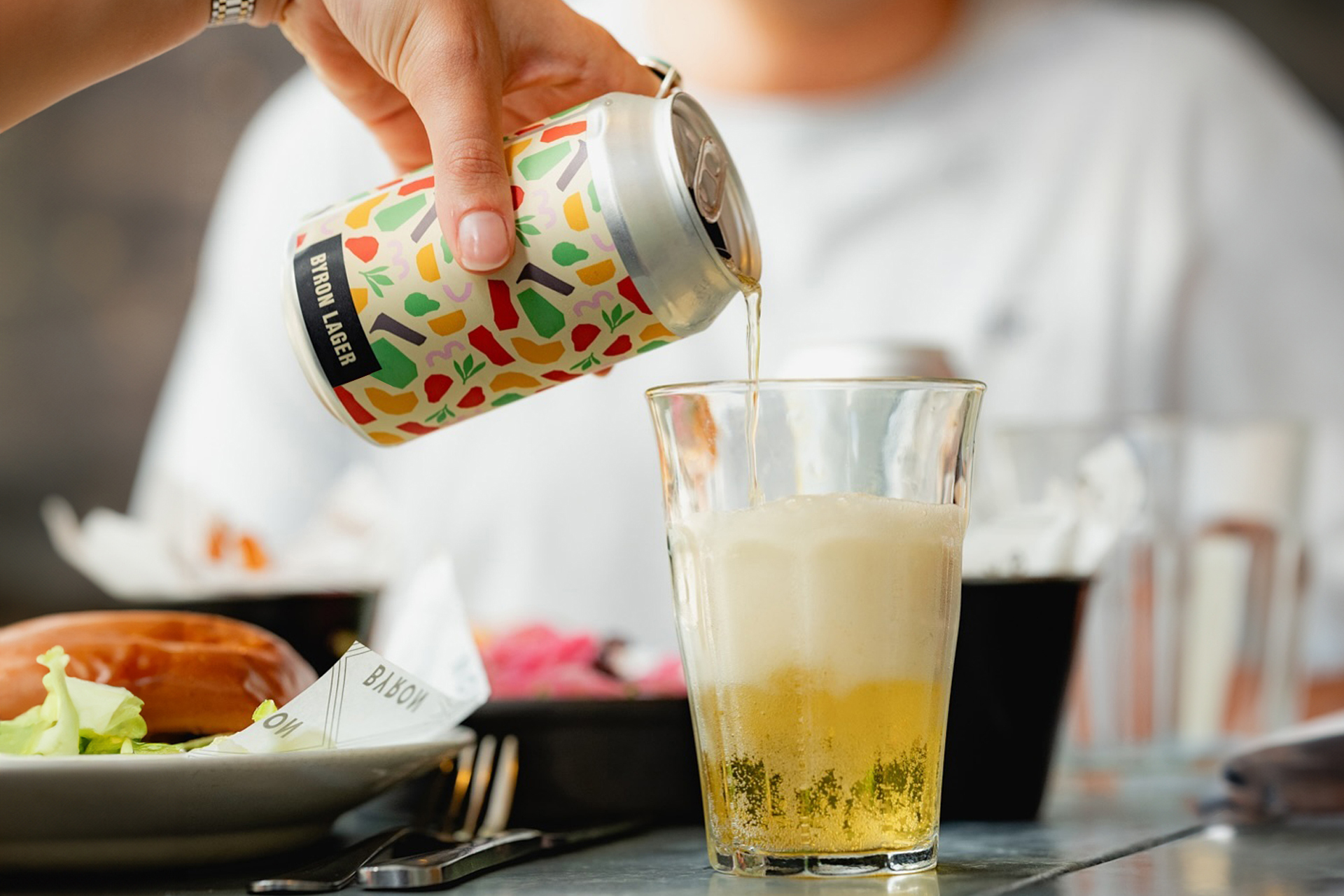
Byron’s house lager and IPA needed to feel like a natural extension of the brand – not an afterthought sitting behind the bar. We made sure they did.
The Challenge
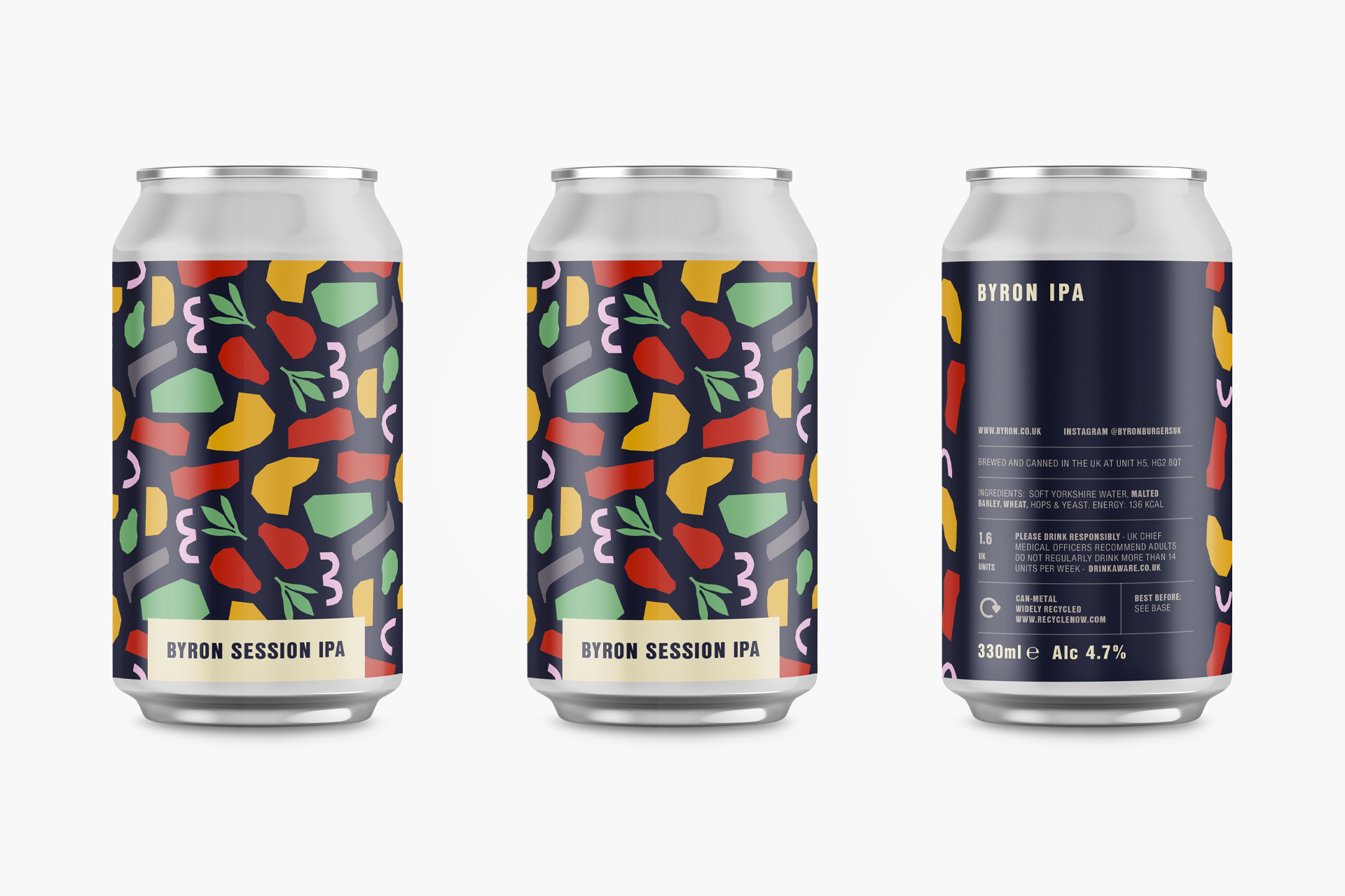
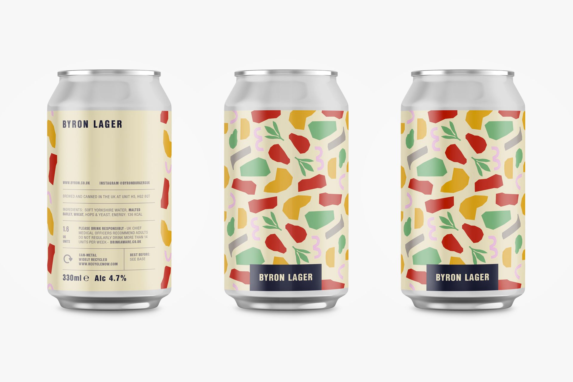
Byron’s craft beer range needed to feel like a natural extension of the broader rebrand – distinct enough to stand on its own, but unmistakably Byron. Production constraints added another layer: the design had to work across cans, taps, and printed collateral while meeting legal compliance.
Our Solution
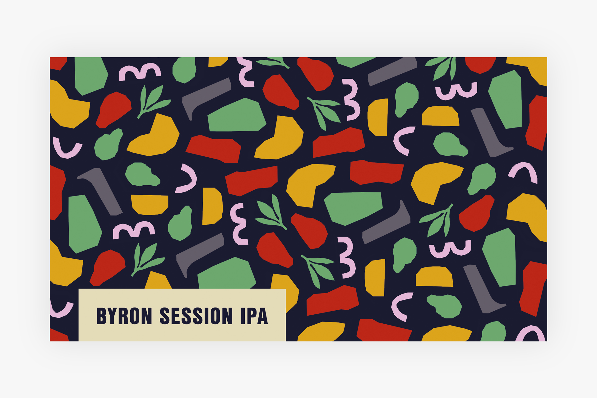
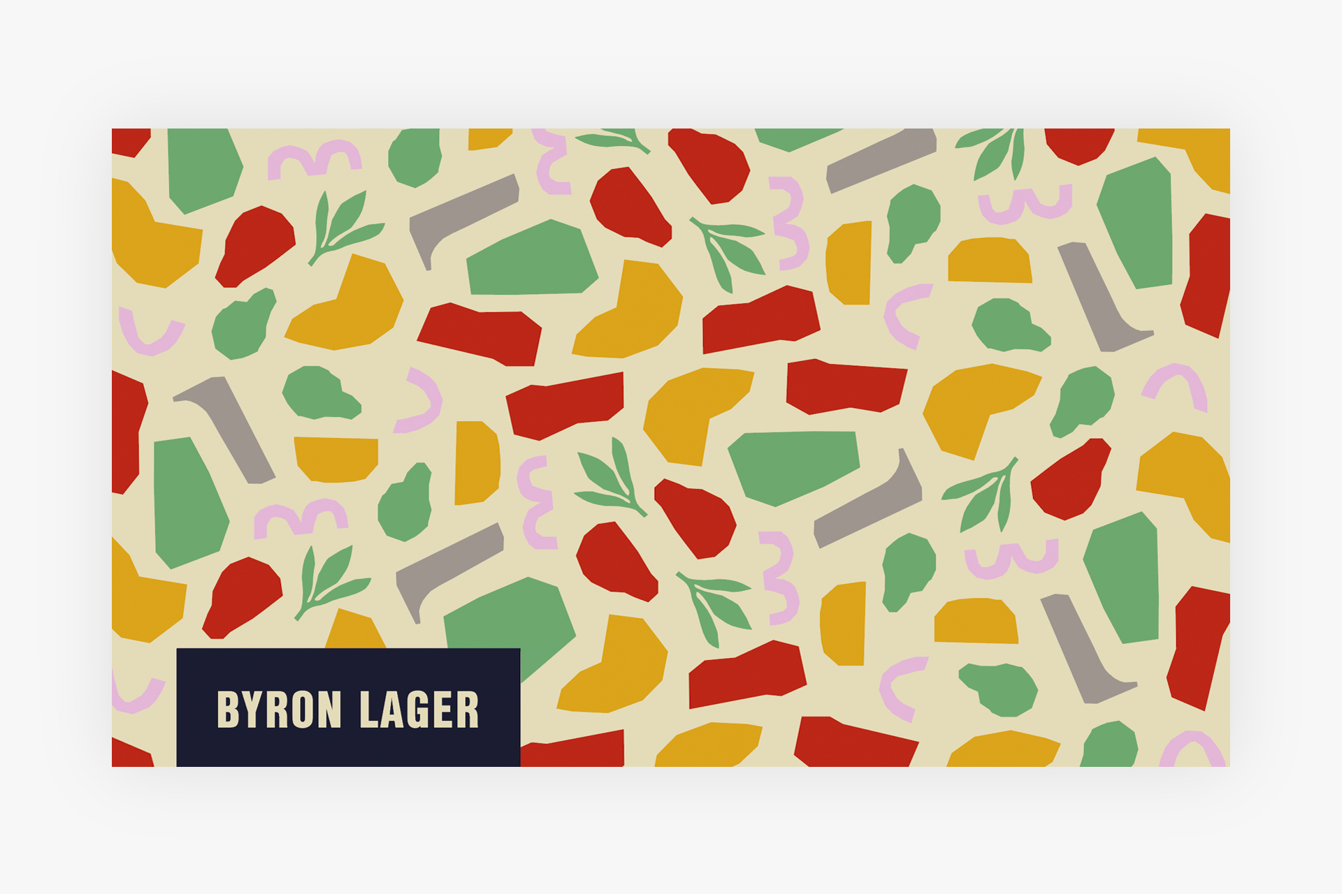
We translated Byron’s signature ingredient shapes into a rhythmic repeating pattern – immediately recognisable, production-ready. Artwork was built to compliance spec for both cans and tap badges, and we press-checked directly with industrial printers to ensure colour fidelity across formats.
Impact
Immediate customer response and a strong sales performance at launch. Byron’s IPA and Lager became its top-selling packaged product – proof that drinks packaging is a commercial asset, not just a design exercise.
Got a hospitality brand that needs a serious creative team? Get in touch!